The design story
It's been an organic process of narrowing our focus tighter and tighter on our two designs. How did we land on these two designs and what makes them so unique? There is a story and of course, it's important to us to share it! We feel it will help students, staff, and the community better identify with their new campus. We used feedback from our student engagements and online surveys, to identify top priorities. They varied by"user" group- our students making up our daily super users, our staff consisting of our long-term users, and our community members who make up our semi-users. Each person's voice is important and is what helped shape our design. To recap on the top three priorities from each group:
- Students identified murals, social space, and campus community space
- Staff identified signage, murals, and a welcoming entrance
- Parents identified campus community space, color coded buildings/disciples, and murals

BOTH DESIGNS: We listened closely to how students describe their current campus vs. how they want the new design to make them feel. We coupled this with how big and confusing the campus is for new users and visitors - its a homogenous sea of the same color buildings with very tiny and hard to find signs. In focus groups, students told us how hard it is to find the library, even the restrooms. It was also interesting to see how students use the campus; where each class hangs out is separated from each other, however the students wish to create a more unified campus community space. Our proposed designs aim to:
- use a warmer, brighter, richer and more sophisticated color palette
- improve building signage and wayfinding to make the large campus easier to use for new students and visitors
- highlight social space by painting existing benches, furniture and architectural elements to distinguish between spaces
Color wise, we were really inspired by the plants and flowers that are already on campus, and received many student, staff and parents comments that valued the landscape elements too. The old growth trees, the massive oaks, and the plants and shrubs that are starting to bloom and bud provided a lot of inspiration for our color palettes. A lot of our users mentioned the landscaping and we feel this helps create a more calming, nature inspired environment. We collected leaves and took photos of different textures, patterns and colors from all around campus and started matching our palettes accordingly. We found that we strayed away from cold grays and blues and gravitated towards warm yellows and greens.

Our samples collected on campus.
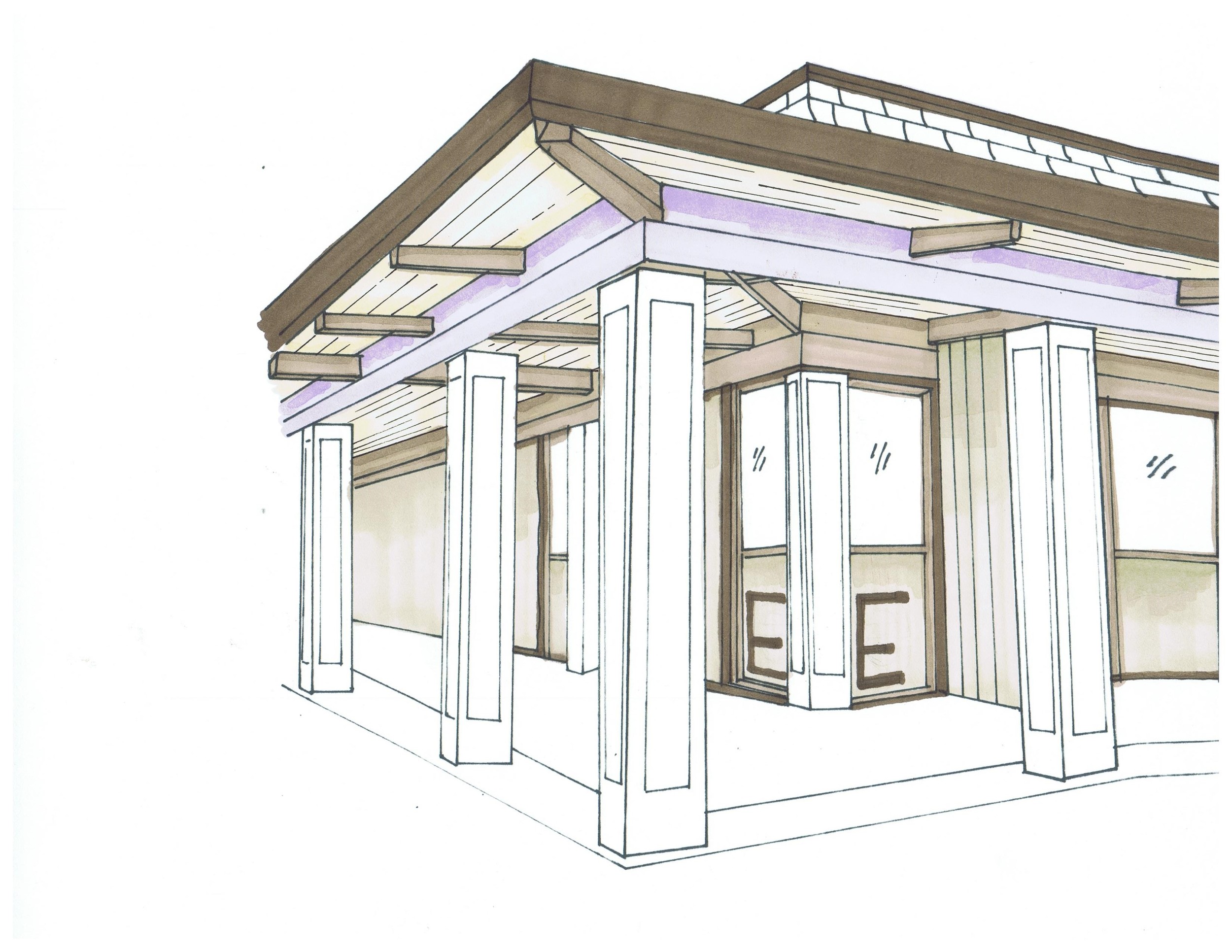
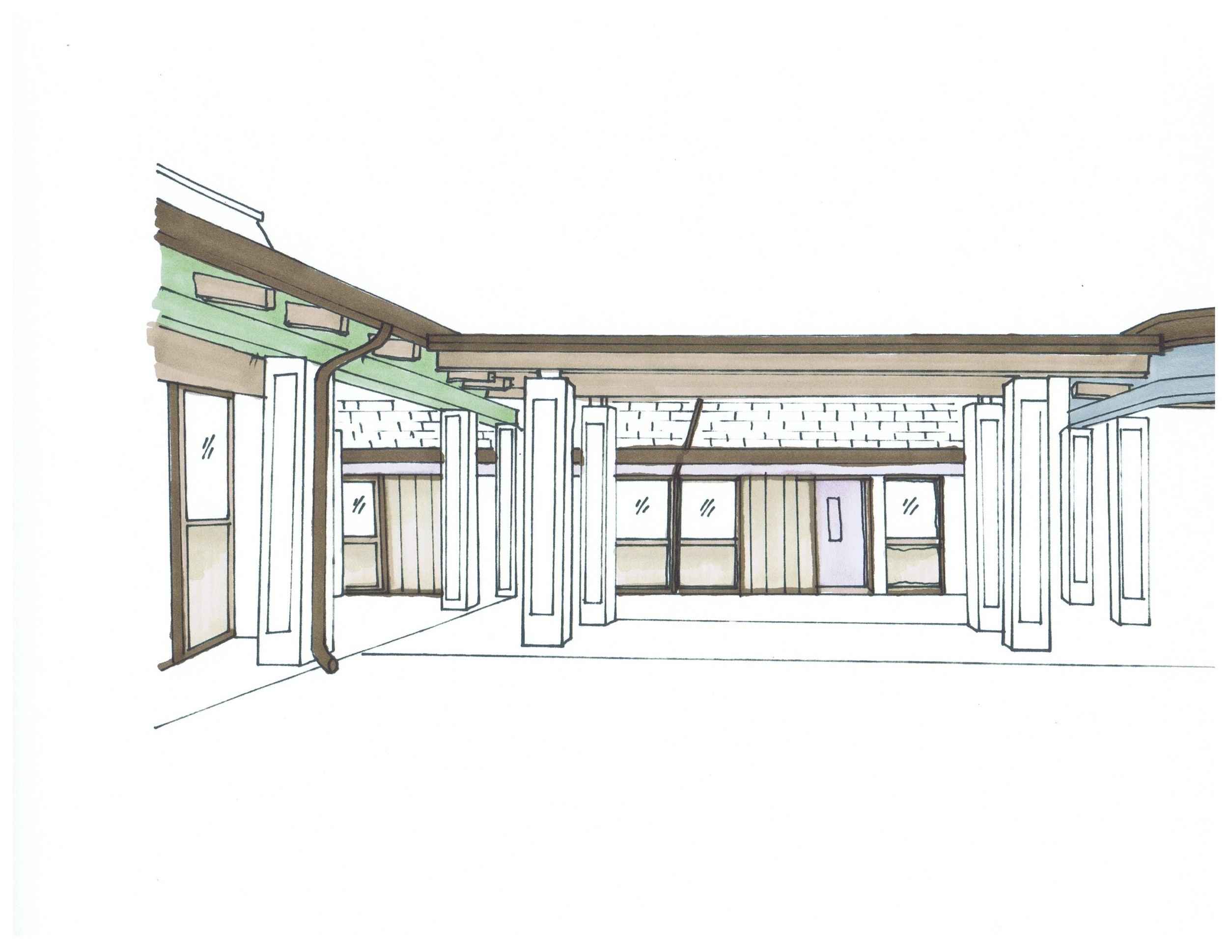
Once we established our color palettes, we tested out colors on different architectural elements of each building. Even though the campus has many buildings, the architecture is uniformly similar and lends itself to exploring different designs. We decided to render by hand with markers to get the quickest results, try out the most diverse amount of options, and to keep the images from looking digitally flat. We developed both schemes through this approach and concluded:
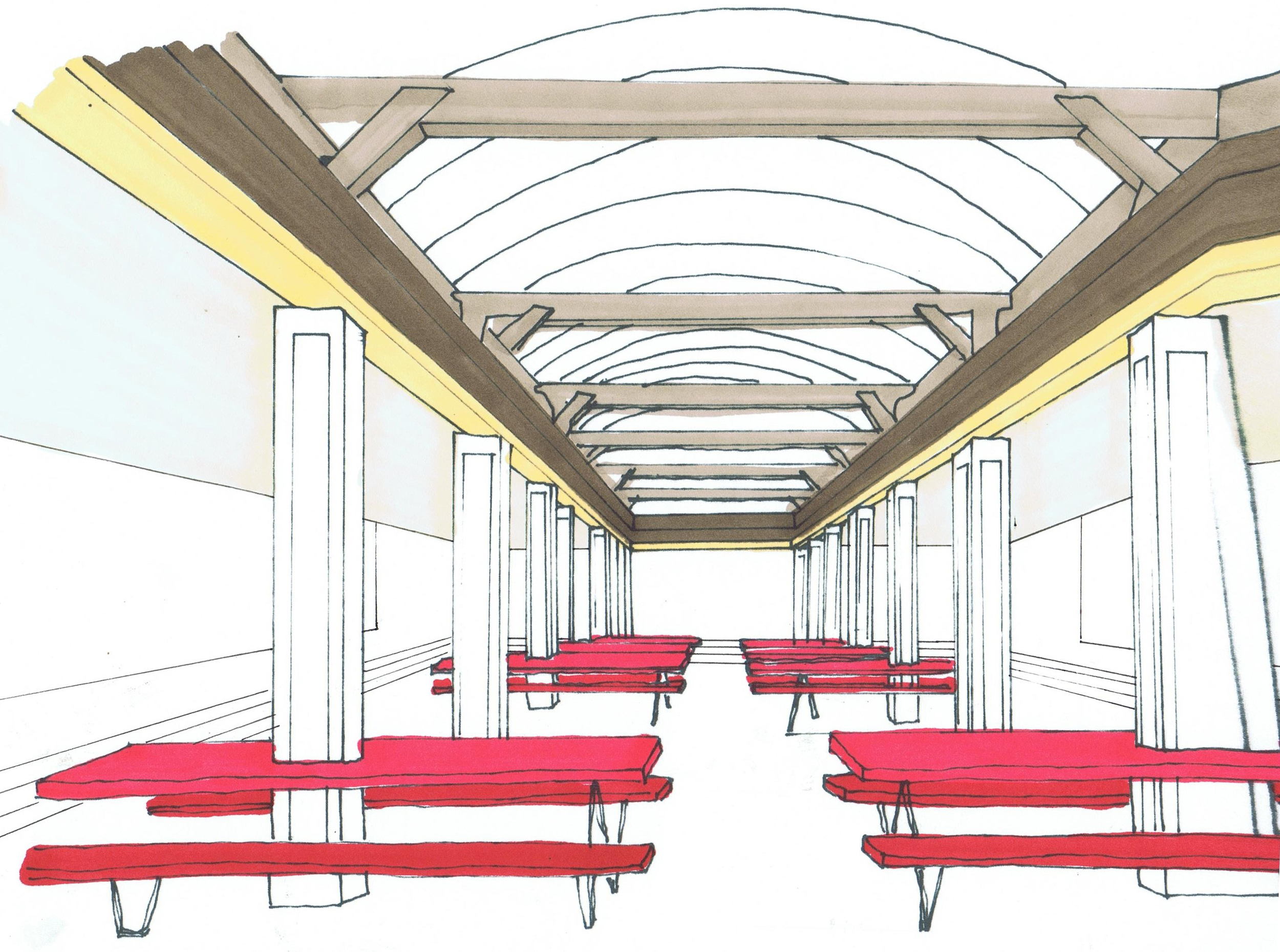
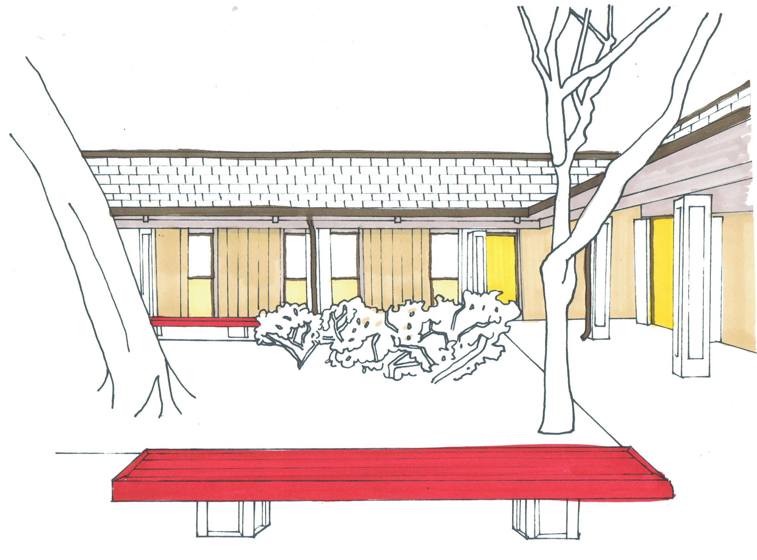
- Ceilings should have the lightest color. Because of the long overhang and how much of the building's walkways are in shade all day, we feel it would help to lighten the campus substantially by painting the ceilings the lightest tone.
- Doors and window panels serve as great locations for "pops" of color and as signage
- Gutters and downspouts should disappear, and rather than be highlighted and therefore we propose painting these the darkest color
WILDFLOWERS COLOR SCHEME: Our initial impression of the Gunn campus is similar to new students and also echoes that of the staff and parents - it's big, it's sprawling, and it all looks the same. For the Wildflowers color scheme, we propose using color to designate different building clusters on campus. Several buildings are already built around an outdoor courtyard so we took these clusters and selected seven different colors to color different clusters. Color would be applied to beams and doors to help improve wayfinding/directions - for example, the J building becomes "the purple building" and the K buildings become the "yellow buildings." We propose a warm and pleasant green palette to be used in coordination with the touches of color. This green palette comes from the natural elements on campus - where colors were matched with leaves and textures we collected. While this is our more colorful idea, it is in keeping with student feedback. Color is used sparingly, in small amounts, as a way to naturally delineate between different buildings.
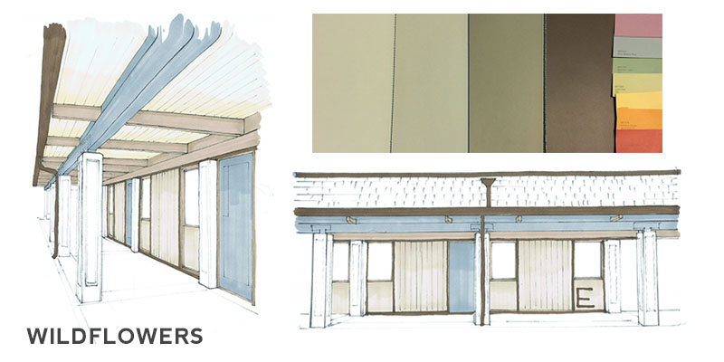

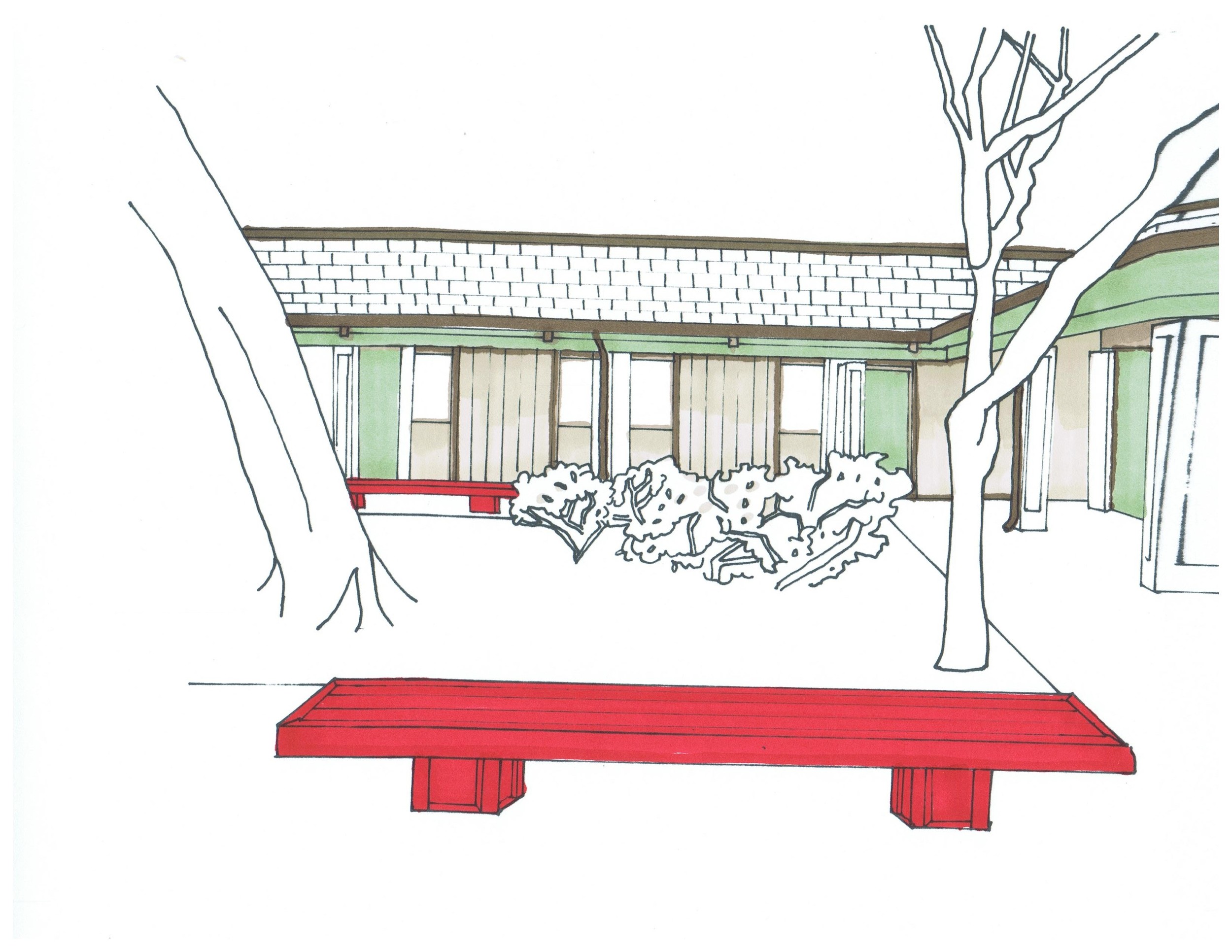
From the very beginning, students recommended "pastel colors" that were calming and soothing. When we surveyed the students asking about their opinions on color palettes, earth and neutral tones were the most popular. In focus groups, we were told that jewel and classic tones felt too intense. Using color chips and testing them on different parts of campus, we tried very bright tones and much more muted tones. We settled on this pastel palette, which reflects many of the colors we found on site, and called the scheme "Wildflowers."
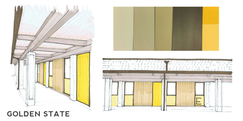
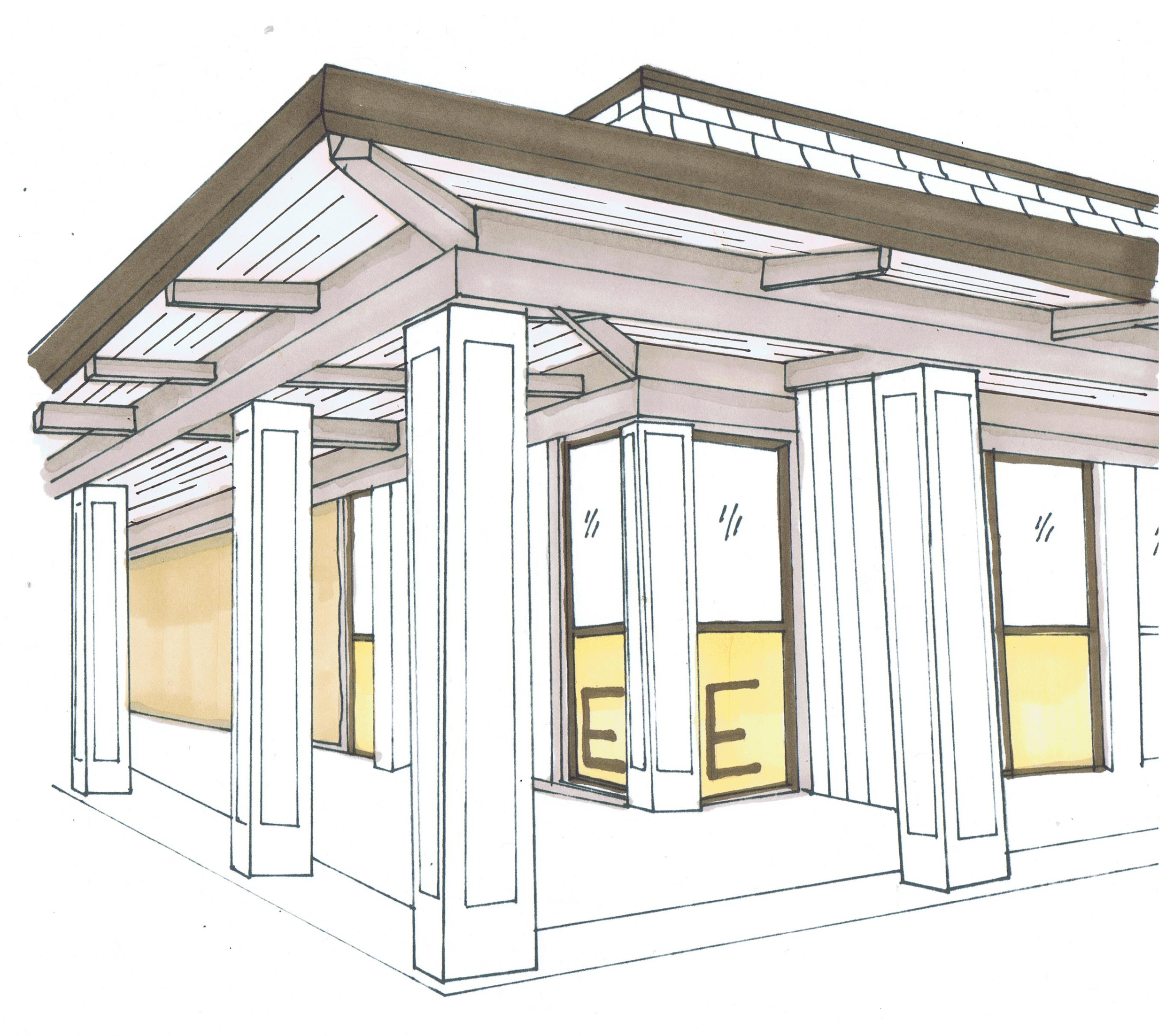
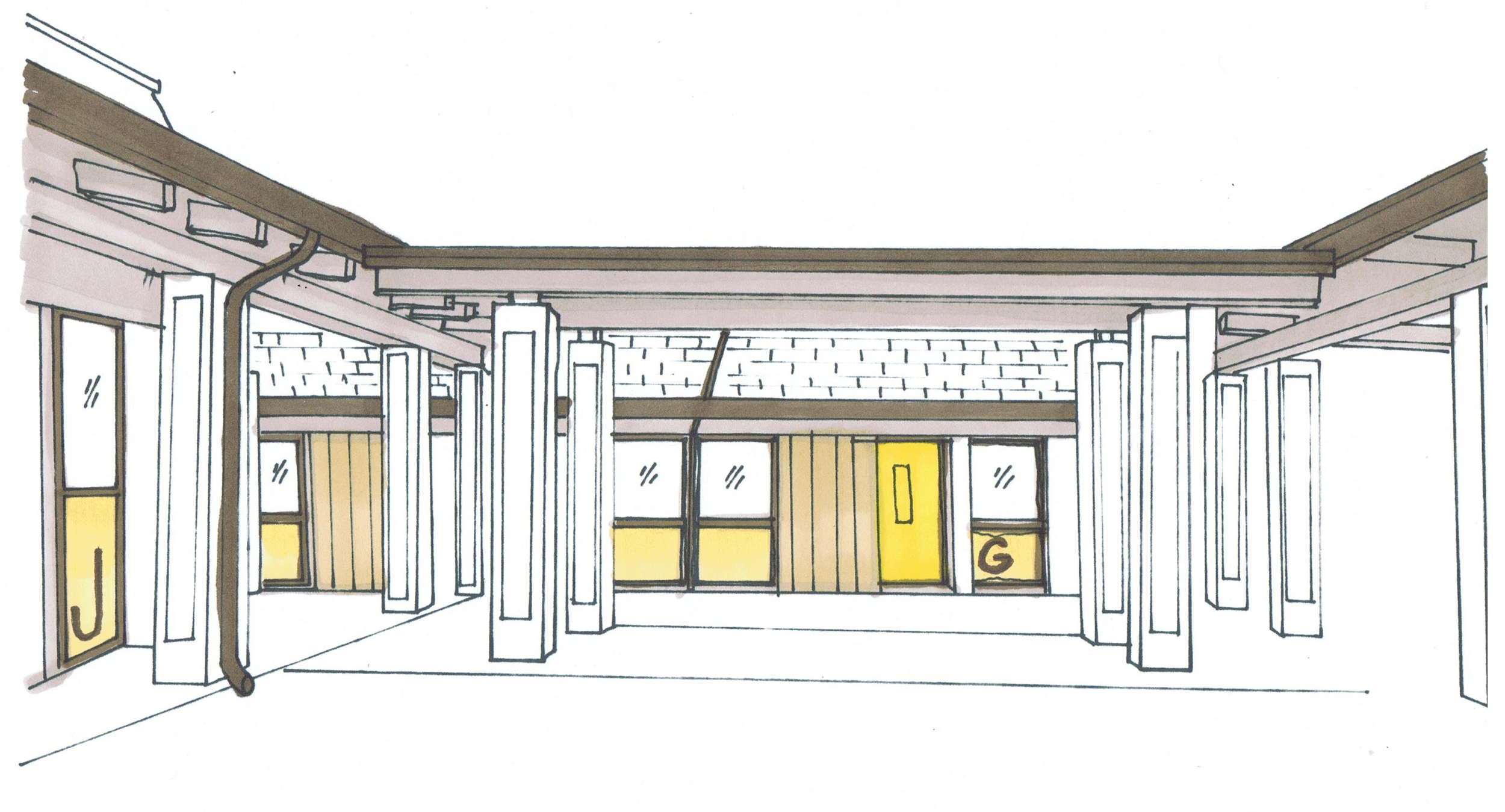
GOLDEN STATE COLOR SCHEME: In our one of our design focus group with advanced art students, we got feedback to showcase a warmer palette. Golden State evolved from further exploration of warm browns and tans as the base. To give the students two different options, this design proposes a uniform paint design using supergraphics, rather than color, to delineate between the different buildings. All of the buildings will be painted the same using the same set of rules. In this case, our rules are to apply pops of yellows to the doors and below windows that coordinate with the warmer, more golden color palette. Supergraphics can be used in to both designs with large building letters on the outside corners of each building so that when anyone is standing in the center of campus, it is easy for them to see what buildings are located where, even from far away.

The campus map is posted above to illustrate our suggested areas of improvement and where the Wildflower Accent colors would go.

Each image has received a positive response from our focus groups.
We are happy with both paint designs and feel they reflect the voice of the students, staff, and community. However, through our thorough engagement and survey results, there are still a number of improvements we are illustrating on our map and describing below.
MURAL AND SUPERGRAPHICS LOCATIONS:
- Library - supergraphics for a welcoming entrance
- Staff lounge - welcoming supergraphics
- Spangenburg - large and colorful murals
- N building steps - campus community space painting both the steps and the large cement wall
- K building - hallway murals designed and painted by students
- Press box - supergraphics for Titan pride
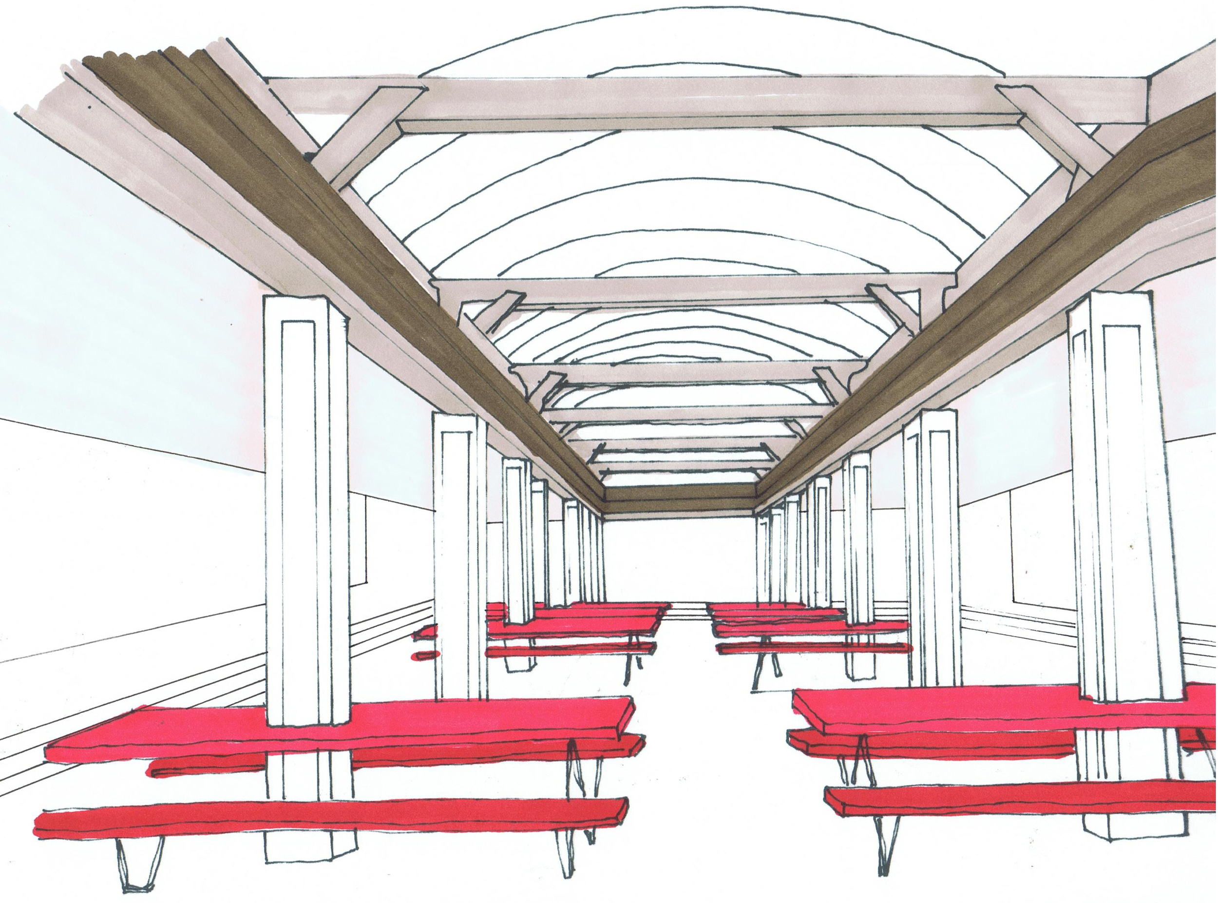
SOCIAL SPACE: the red dots on our map indicate social spaces defined by how the students filled out our opportunity mapping questions. Two of our main renders illustrate red painted benches in social spaces, including the bat cave. Using similar red tones, we propose to paint social spaces.
RESTROOM SIGNAGE: several students have informed us of spaces that are difficult to find, including the restrooms. We suggest larger graphics and colors to help make them easier to find.
CAMPUS COMMUNITY SPACE: an ideal location for a shared space is at the N stairs. This building is easy to find since its the only two story building on campus. The stairs have lots of blank space for color and paint.
Stay tuned for our next blog post where we dive deeper into these improvements. Look for the 2 proposed schemes to be posted Wednesday, Thursday and Friday of this week. You will find the proposals posted at the Library Lobby, near the Quad, within the Bat Cave and near the entrance to Spangenberg. Come by to see the color swatches in person, check out the 2 proposals, and then cast your vote at http://www.paintgunnhs.com/vote!